CoffeeCup Responsive Foundation Framer 2.5.545

Вся мощь Foundation 6. Без кодирования. Front-end фреймворки обеспечивают надежную систему сетки и хорошо проверенную библиотеку предопределенных стилей. Модули jаvascript позволяют создавать интерактивные компоненты сайта, такие как выпадающие окна и отзывчивые навигационные шаблоны.

Customize Prebuilt Components
Choose from navigation menus, accordions, cool tab panels, modal dialogs, drop ups, and much, much more.
Create your own Interactive Components
Visually combine HTML elements, (predefined & custom) CSS. Then mixin interactive scripts to create off-screen navigations, flex-cards, info-pop-ups, or galleries. Really, there’s no limit to what you can build!
Link Elements or Entire Components
Symbols represent linked elements or groups of elements. A change to a symbol item will globally update all instances of that symbol. Content such as text, images, and even component structures such as navigation menus, only need to be updated once.
Unchained Flexibility
Easily browse symbols with the preview function and navigate to specific instances with the click of a button. In case a variation of a symbol is needed, simply unlink an instance and it will stop being affected by global updates.
It's Minimal and Modular
Combine elements, create styles and add scripts. It’s like playing with technic lego (instead of duplo…)
Has the Toggler
Which really rocks! Create all types of interactive elements by swapping out classes or revealing hidden items.
Includes Motion UI
This library helps to create flexible UI transitions and animations through the use of simple data attributes.
Battle sameness. Unleash. Design creativity.
Why do so many responsive websites look so similar? Restructuring the layout and predefined breakpoints in a mobile-first workflow can be a pain when hand coding. Foundation Framer features all the controls for visually creating unique designs, from XS to XXXL screens! Not having to worry about code allows for more experimentation and stimulates creativity. The snazzy interface and intuitive style controls guarantee unique designs that are out of this world.
A case for flexibility and designing with real content.
When we mapped out how our responsive apps would function, we focussed on the core of a device-agnostic design: custom breakpoints with a fully adaptable layout. After all, fanciness can only be built upon solid grounds. Curious why that is? Let’s take a look at a real design case.
By default, Foundation 6 comes with 2 breakpoints.
These are the blue dots on the image below. Now look at the layout. The two column design looks great at the current width, but at smaller screens a single column might be preferred. However, using the default breakpoints, it would need to be one or the other; either a single column or a two column for every screen smaller than 640px.
Add breakpoints with a click.
The ability to easily add custom breakpoints to adapt the layout, while working with real content, leads to more flexibility and better design decisions. In this case, a custom breakpoint (the white dot) is added that changes the layout from a single column into a two column structure at 450px. Different spacing often leads to changes to font sizes; this and other design changes can be applied at breakpoints as well.
Design for extra large devices with no pain.
A similar case can be made when designing for (very) large screens. What about pulling up two columns and creating a six column row? With Foundation Framer, It’s a decision the designer can now make with limited effort. Ultimately this will create better user experiences on all devices. Breakpoints when and where you need them. As seen from the examples, defining breakpoints without layout and content is meaningless. Design or layout changes need to be based upon the actual content for an optimal user experience. Breakpoint management is key for creating truly device-agnostic designs.
Automagically design with CSS.
Use the full layout power of CSS simply by selecting options, pressing buttons and specifying dimensions. It will not just be imaginative, it will be ingenious!
Use the P for "picture" and performance
Rescue mobile viewers from downloading heavy, slow-loading image files. Using the Picture element you can serve a friendlier size to every viewer.
Paramount Positioning Controls
Place content where you want it. Choose your display, absolute positioning, set to clear or float, or simplify your life by using the incredible, visual Flexbox controls.
Multiple background capabilities
Don’t limit yourself to a single backdrop. Layer multiple backgrounds for extra dimensions to get a truly immersive look.
Color Palette Management
Use the precise picker to grab the colors from anywhere on screen. Keep them organized and reuse them by saving them to your palette.
Tasty Typography
Clickable controls make it a breeze to set and style your message. It's loaded with customizable Google fonts too. With the inline editor you can personalize special text with its own appearance.
Easy Layout Management
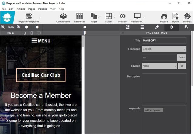
Click through the Layout pane to structure your layout. Add, delete, and merge rows and columns to hold content. Adjust span widths, offsets and push & pull settings too!
Hand-tweaking is an option too!
Foundation Framer is a visual app, but any code-connoisseurs who want the ability to dive into the backend have that option too. Export to any code editor to manually edit the crisp and clean markup. Sweet: linked in custom stylesheets, will not get overwritten when re-exporting!
ОС: Windows 11, 10, 8/8.1, 7, Vista
Скачать программу CoffeeCup Responsive Foundation Framer 2.5.545 (183,6 МБ):

